E Design Studio

Enagen Bio

Enagen Bio is a premium hair care and scalp wellness brand focused on scientifically formulated solutions for diverse hair concerns.
E Design Studio partnered with the brand to create a cohesive packaging ecosystem, a comprehensive brand guideline manual, and a unified visual identity across its growing product portfolio.

Client

Enagen Bio

Category

Personal Care

Services

Brand Identity & Brand Guidelines

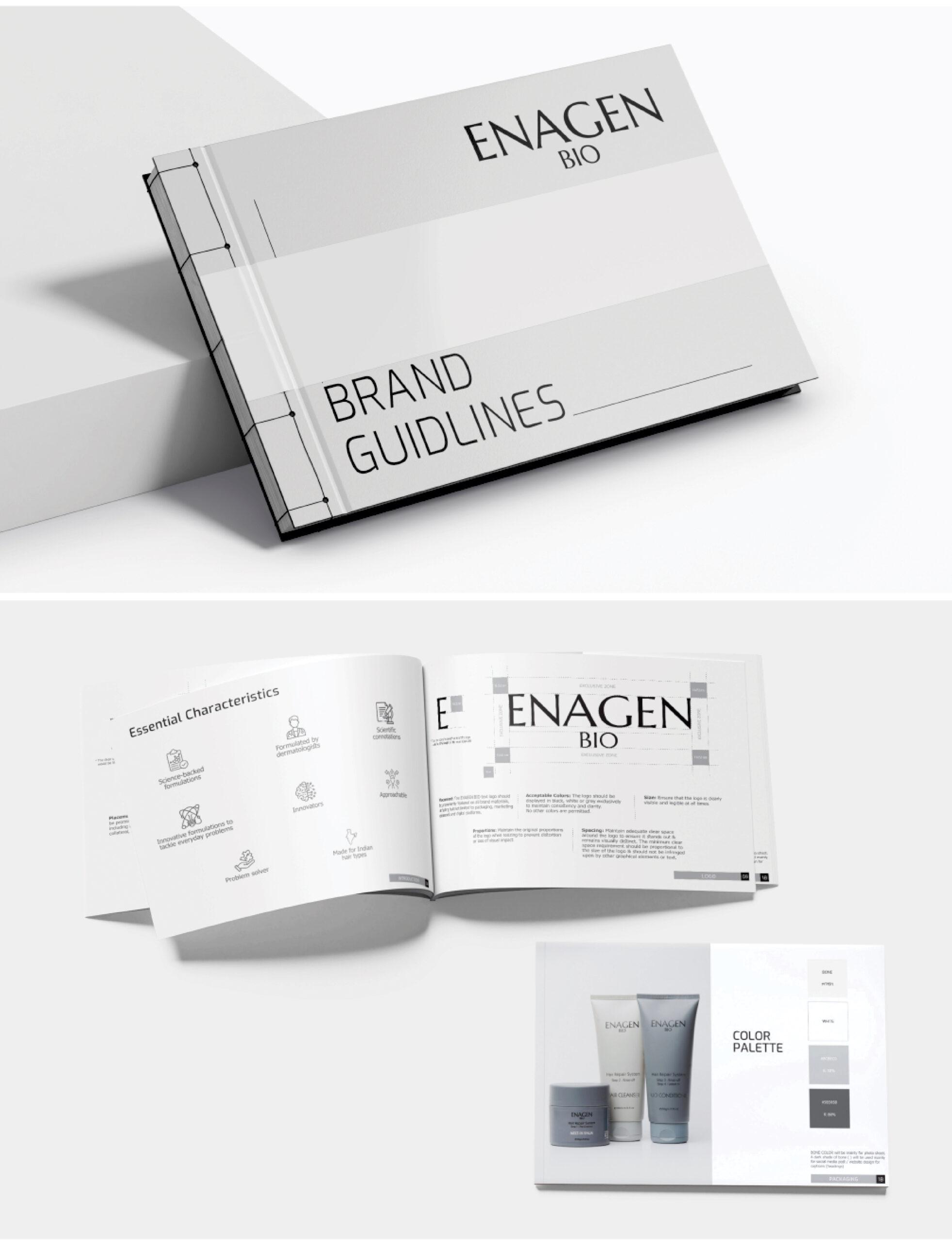
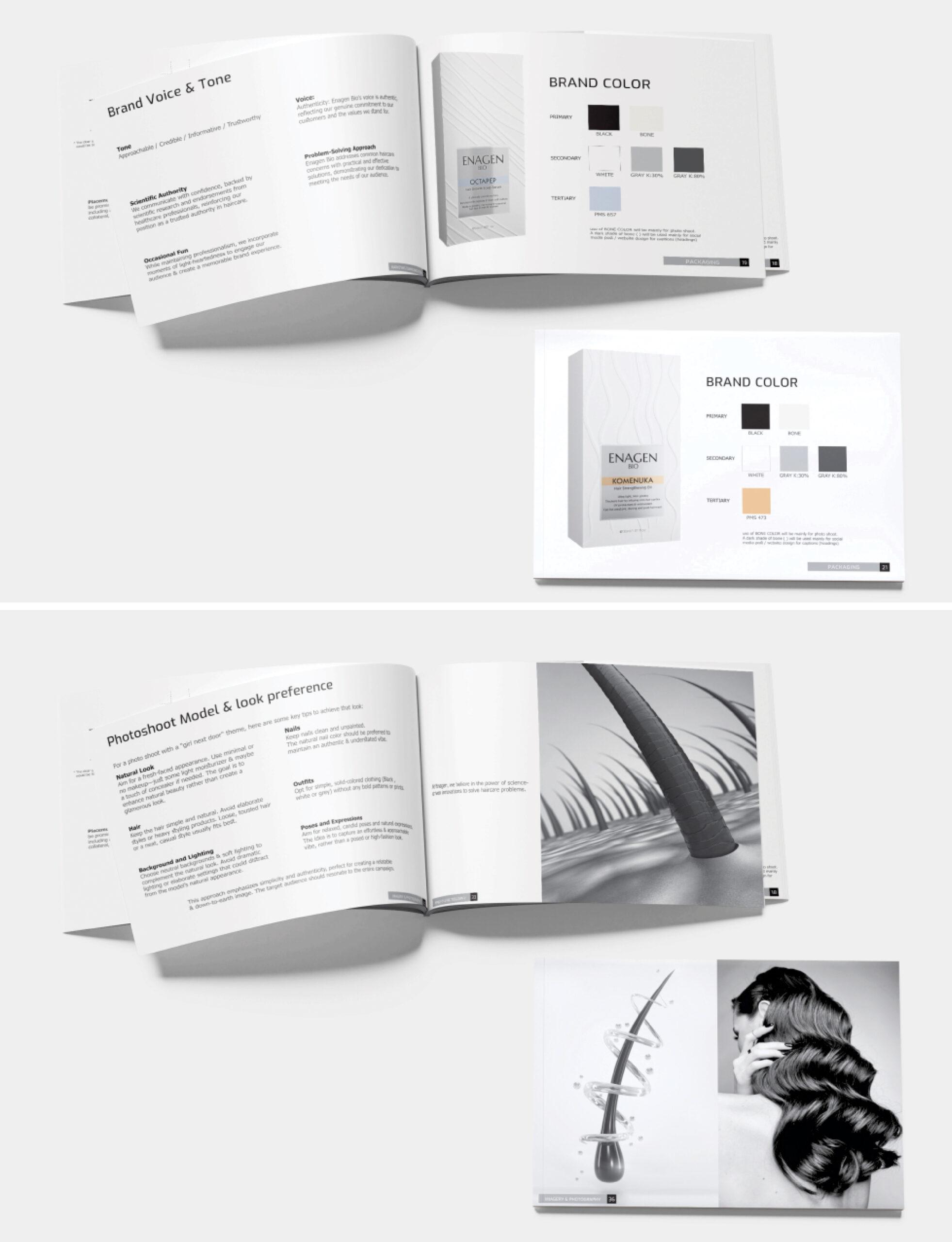
E Design Studio developed the comprehensive brand guideline book for ENAGEN BIO, establishing a cohesive visual identity and communication framework for the brand. The project brings together the brand’s positioning, personality, visual language and application guidelines into a structured document that ensures consistency across all brand touchpoints.

The guideline book covers the brand’s essential characteristics, logo usage, typography, colour palette, brand voice and tone, packaging design principles, and visual communication direction. It also establishes photography and photoshoot guidelines to maintain a consistent aesthetic across brand imagery and marketing communication.

Through a clean, contemporary and systematic approach, E Design Studio created a comprehensive brand reference that translates ENAGEN BIO’s identity into a unified visual experience, providing a strong foundation for future brand growth and communication.


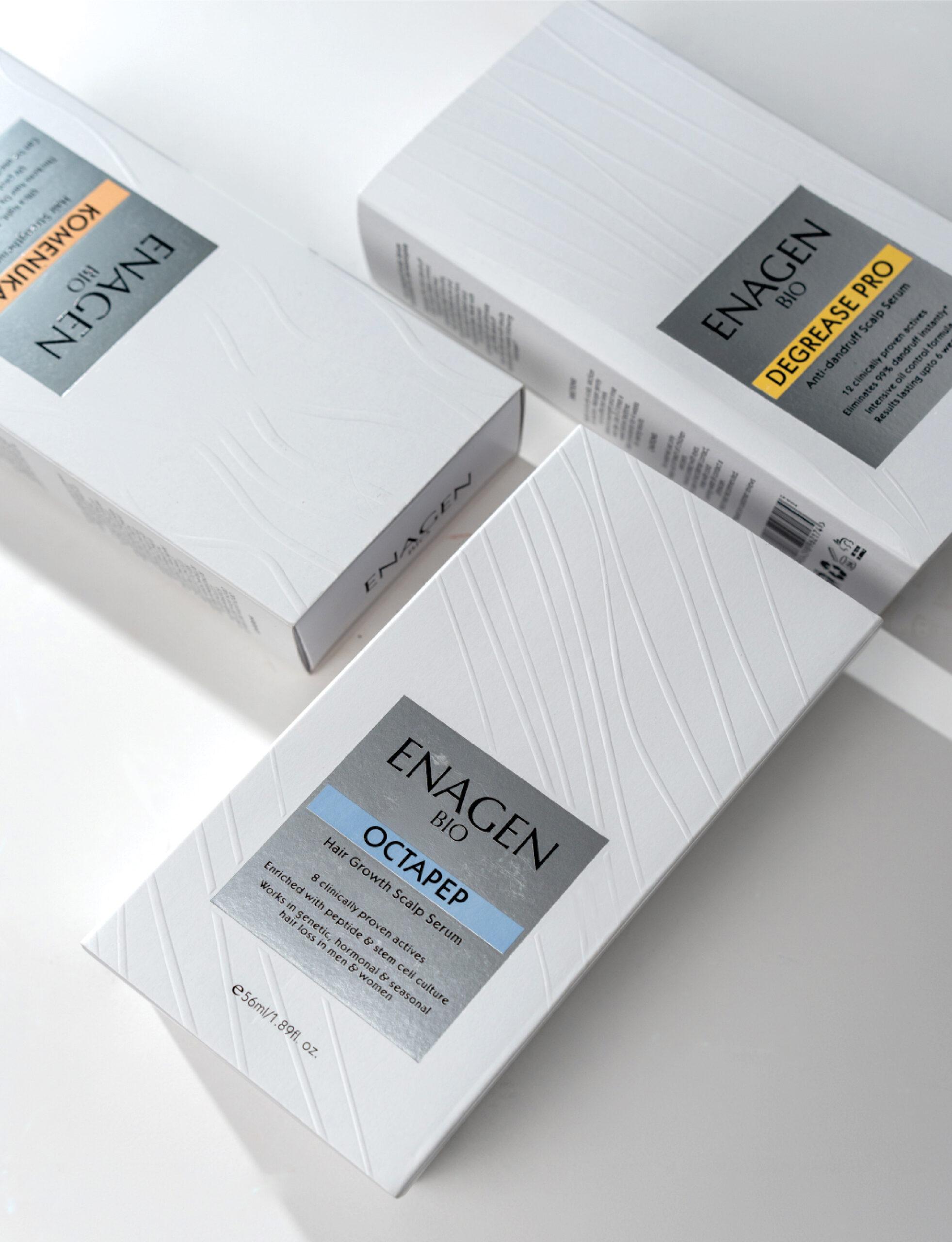
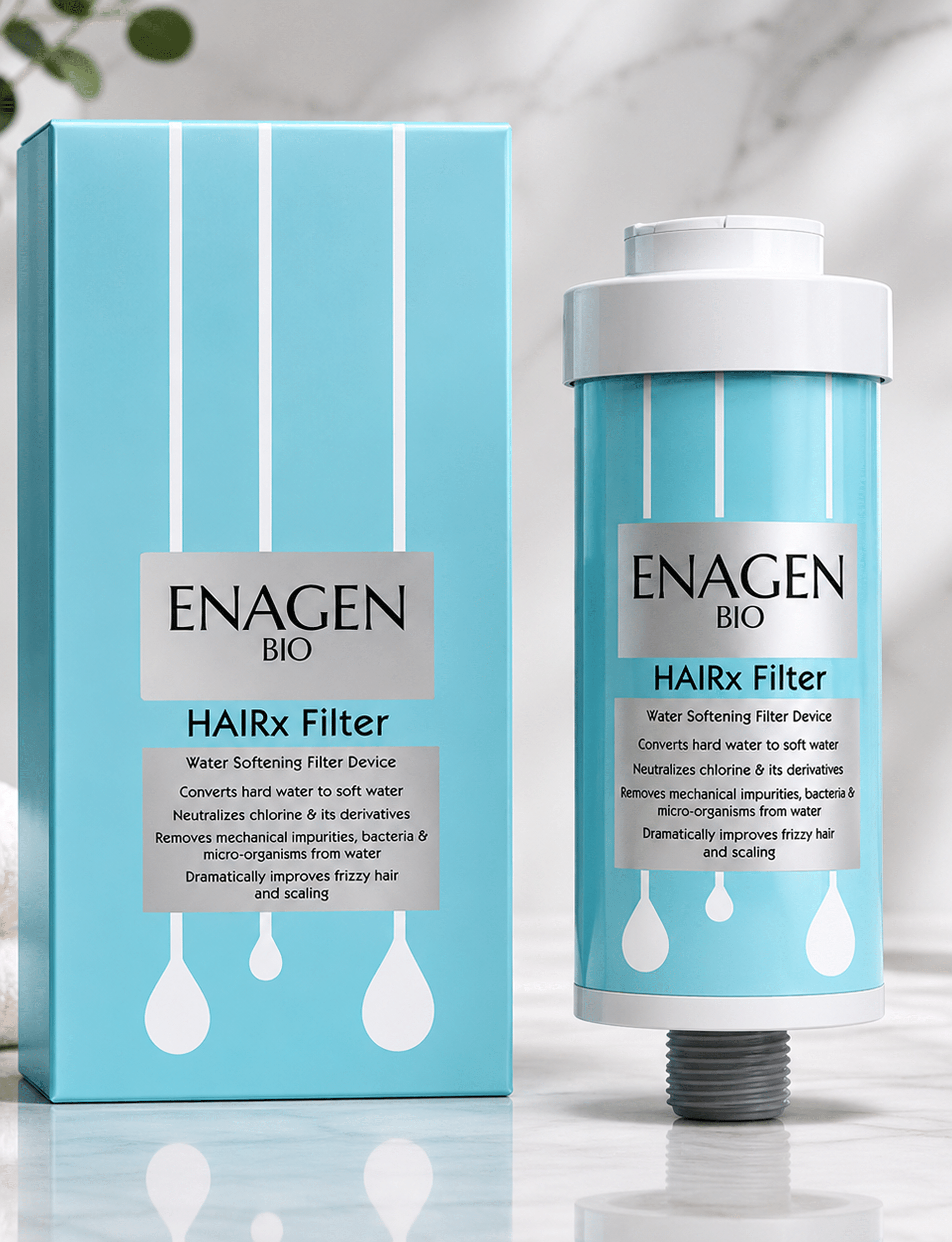
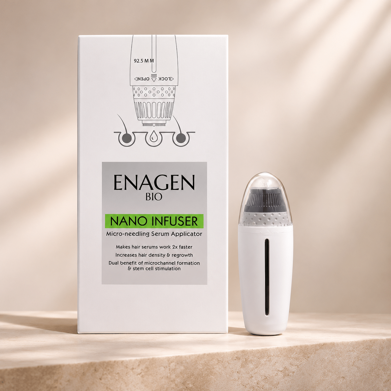
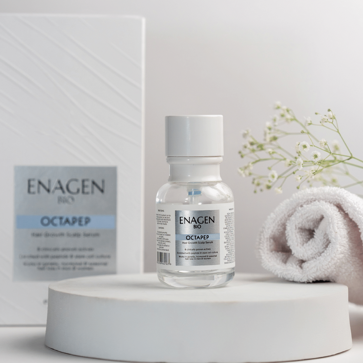
We developed a comprehensive packaging system for hair growth serums, strengthening oils, scalp treatments and specialised applicators. Each product maintains a cohesive brand identity while creating visual distinction through colours, typography, material finishes and refined detailing.
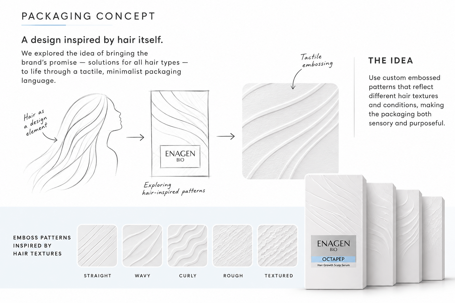
A defining feature of the packaging design is the use of custom embossed patterns inspired by different hair textures and conditions—straight, wavy, curly, rough and textured hair. These tactile patterns bring depth and individuality to each pack while reinforcing ENAGEN BIO’s philosophy of addressing diverse hair and scalp needs.

From concept development and packaging design to product visualisation and brand guideline development, E Design Studio created a unified brand experience that seamlessly extends across the product range.

The result is a contemporary, premium packaging language that brings together scientific credibility, thoughtful design and a distinctive shelf presence.

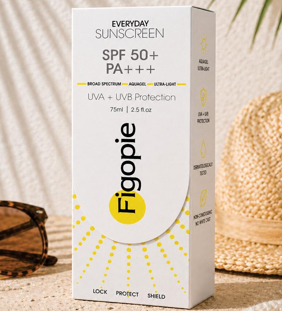
Figopie

Brand Identity & Sunscreen Packaging Design

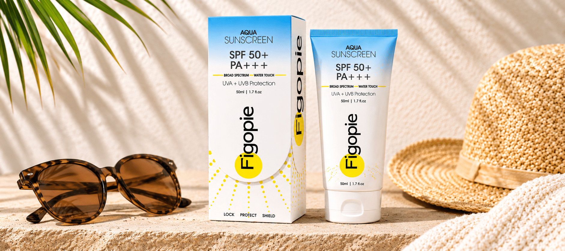
E Design Studio developed the brand identity and packaging system for Figopie, a dermatologist-approved sunscreen brand combining clinical credibility with contemporary aesthetics.

Client

Figopie

Category

Personal Care

Services

Creative Highlights

A cohesive, contemporary packaging identity that balances skincare credibility with strong shelf appeal.

  • Designed a distinctive brand identity with a clean, modern skincare appeal.
  • Developed an innovative slide-box packaging structure for enhanced product experience.
  • Introduced sun-ray graphics as a signature visual element symbolising sun protection.
  • Used a clean white palette with subtle colour accents for variant differentiation.
  • Created clear visual hierarchy for SPF 50+, PA+++ and UVA & UVB protection claims.