Brand Naming & Logo Design
The Name – A Promise to Skin, A Wow in Every Experience
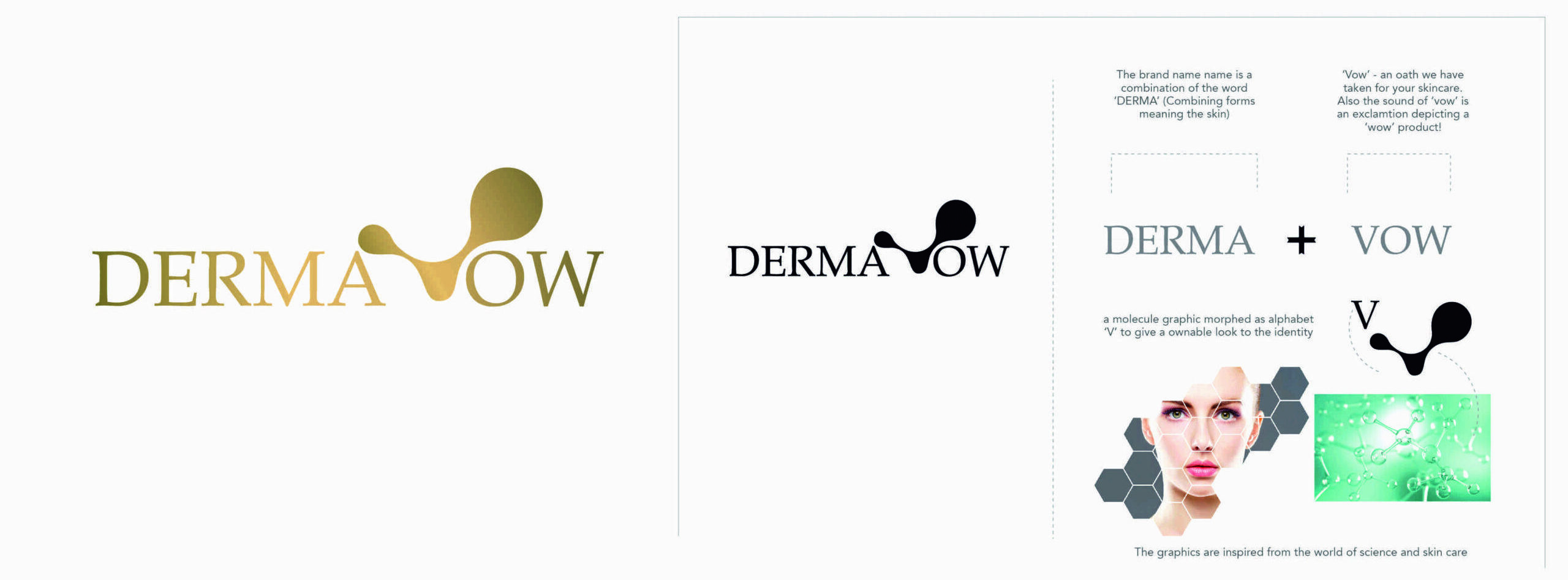
The name DERMAVOW was conceptualised by combining DERMA, representing skin and dermatological science, with VOW, symbolising a commitment to skin protection, care and well-being. The name also carries an expressive second meaning—WOW—reflecting the aspiration to deliver remarkable skincare experiences and results.
The Logo – Science Meets Skin
The logo brings together elegant typography and a distinctive molecular-inspired graphic element. The abstract form integrated into the wordmark represents the science behind skincare, while its fluid, organic structure creates a visual connection with skin, nourishment and care. The refined gold palette adds a sense of premium sophistication, positioning DERMAVOW as a contemporary, science-led skincare brand.
The result is a meaningful brand identity built around a promise to protect skin and the potential to create a WOW experience.