Vibo
Creating a Brand That Celebrates Life
From a brand name to a complete beverage identity.
Client
Vibo
Category
Beverages & Snacks
Services
- Brand naming & logo design
- Brand identity development
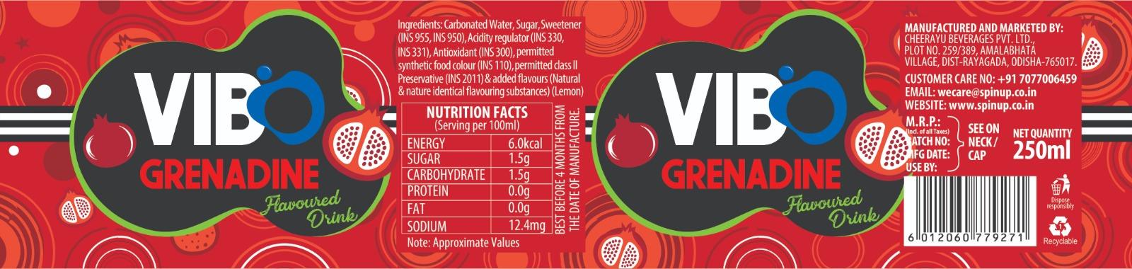
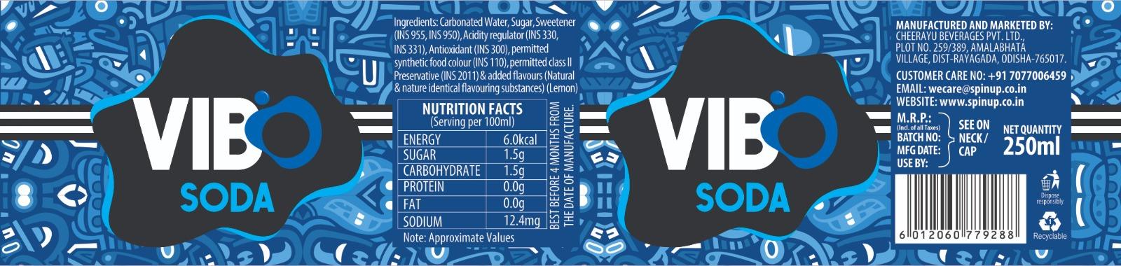
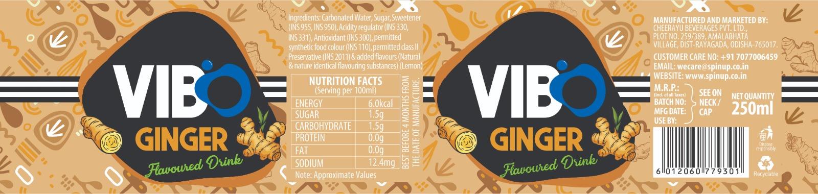
- 12-SKU CSD packaging design
- Promotional banners & brochures
- 3D product mockups
- Marketing & brand collaterals
Brand Name Development | VIBO
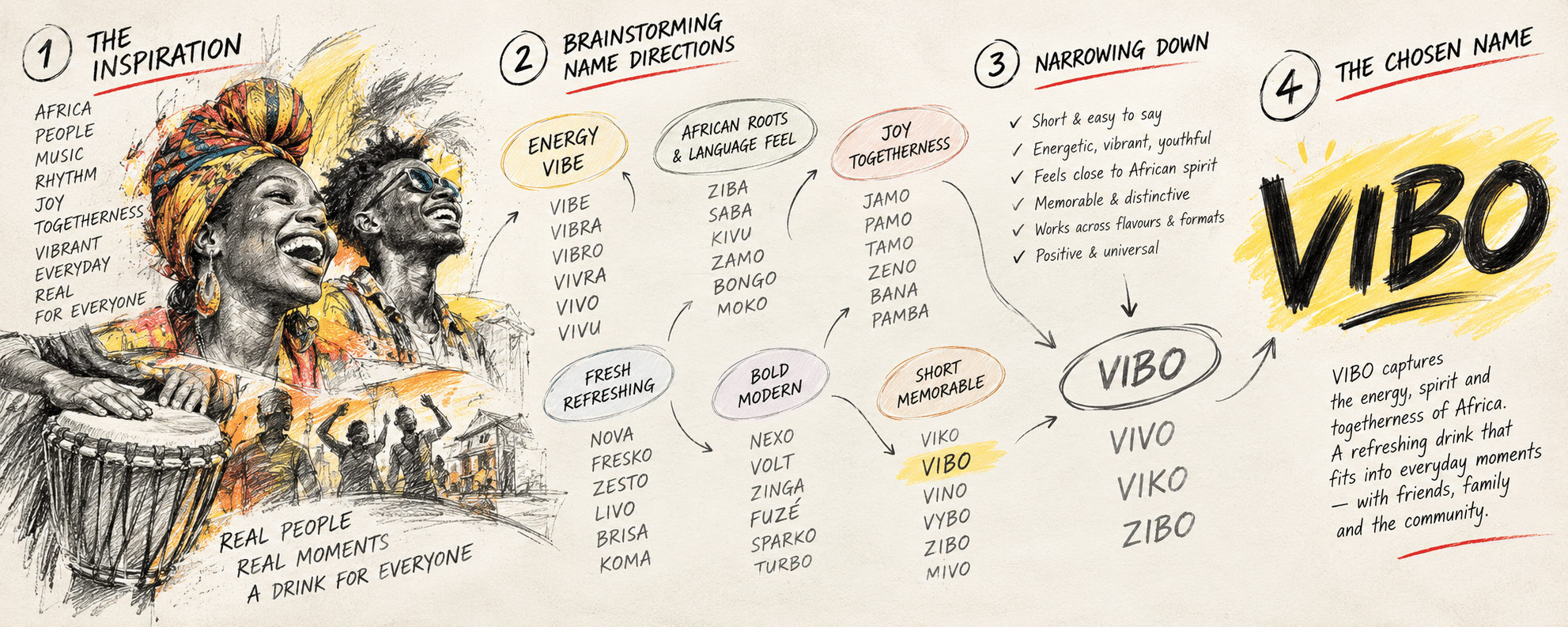
The naming process for VIBO began with exploring the spirit of Africa — its people, music, rhythm, energy and sense of togetherness. We brainstormed across different naming directions, looking for something short, memorable, youthful and easy to pronounce.
VIBO emerged as a name that captures the energy and vibrant spirit of everyday life. Simple yet distinctive, it brings together the feeling of a lively, refreshing drink and the joy of sharing moments with friends, family and the community.
Logo Development
The VIBO logo was developed around the idea of freshness and refreshment. We began with the form of a water droplet, exploring fluid shapes that could translate into a simple yet distinctive symbol. The form was gradually refined into a bold, rounded graphic that feels energetic and memorable.
Paired with a strong red wordmark, the blue droplet-inspired symbol brings together confidence, freshness and a youthful spirit, creating a logo that is instantly recognisable and well suited to a vibrant beverage brand.
The Creative Thinking
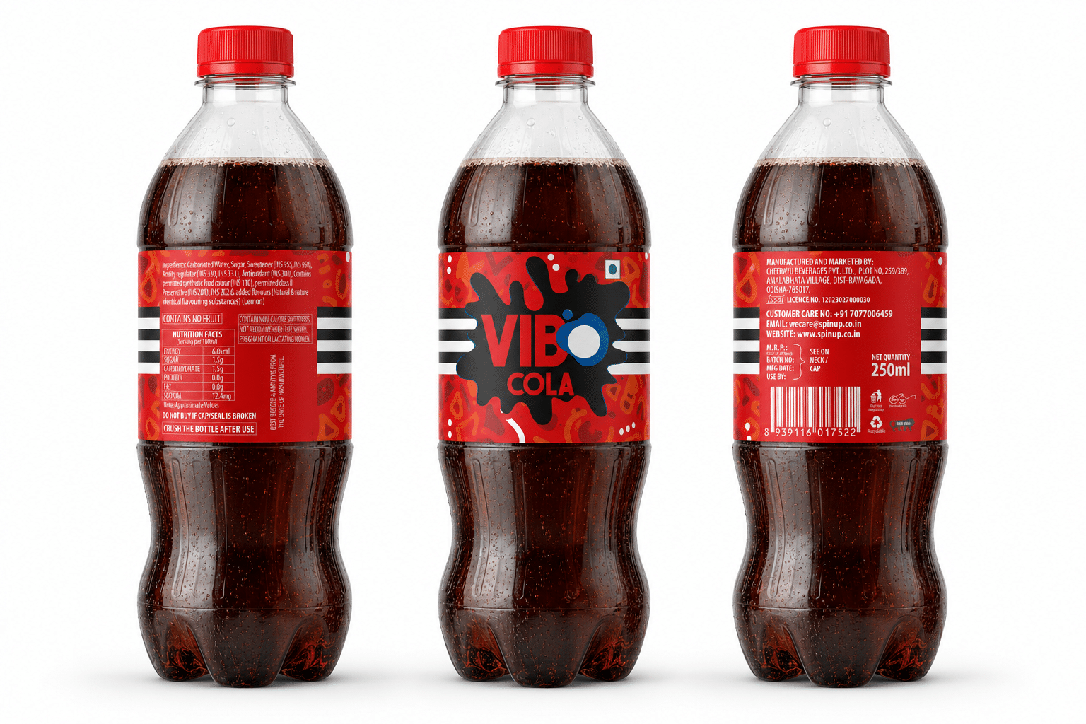
For VIBO, we wanted the packaging to do more than simply communicate the flavour of the drink. We wanted it to capture a feeling — the excitement, joy and spontaneity associated with enjoying a refreshing beverage.
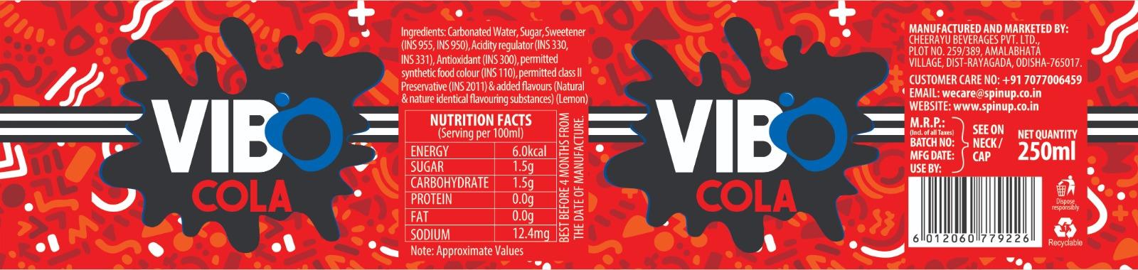
This became the foundation of the visual language developed for the brand. Drawing inspiration from elements of joy, art, dance and celebration, we created a distinctive graphic style using expressive illustrations, patterns and energetic visual compositions.
These graphics became an integral part of the label design, giving the packaging its own character and making the range instantly lively and engaging.
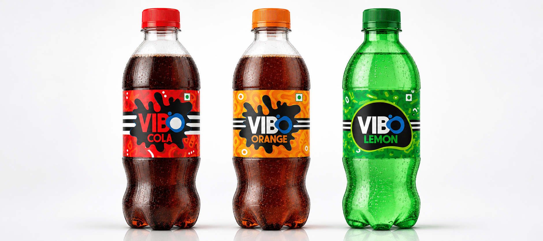
A Range of 12 SKUs, Each with Its Own Personality
One of the key aspects of the project was developing packaging for all 12 SKUs within the CSD category.
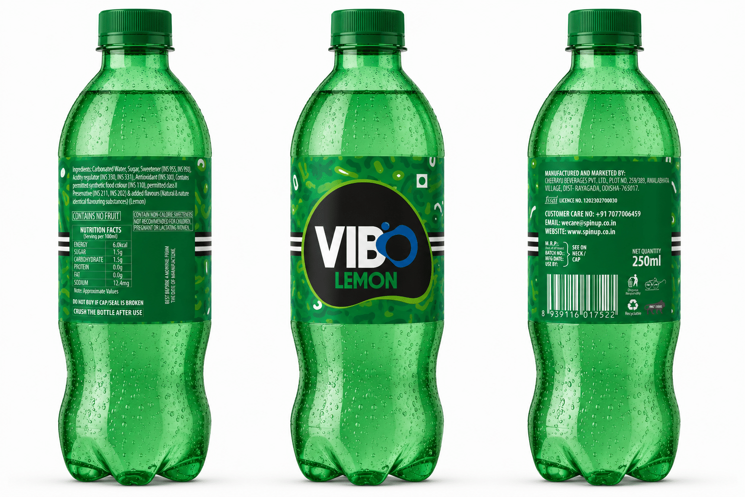
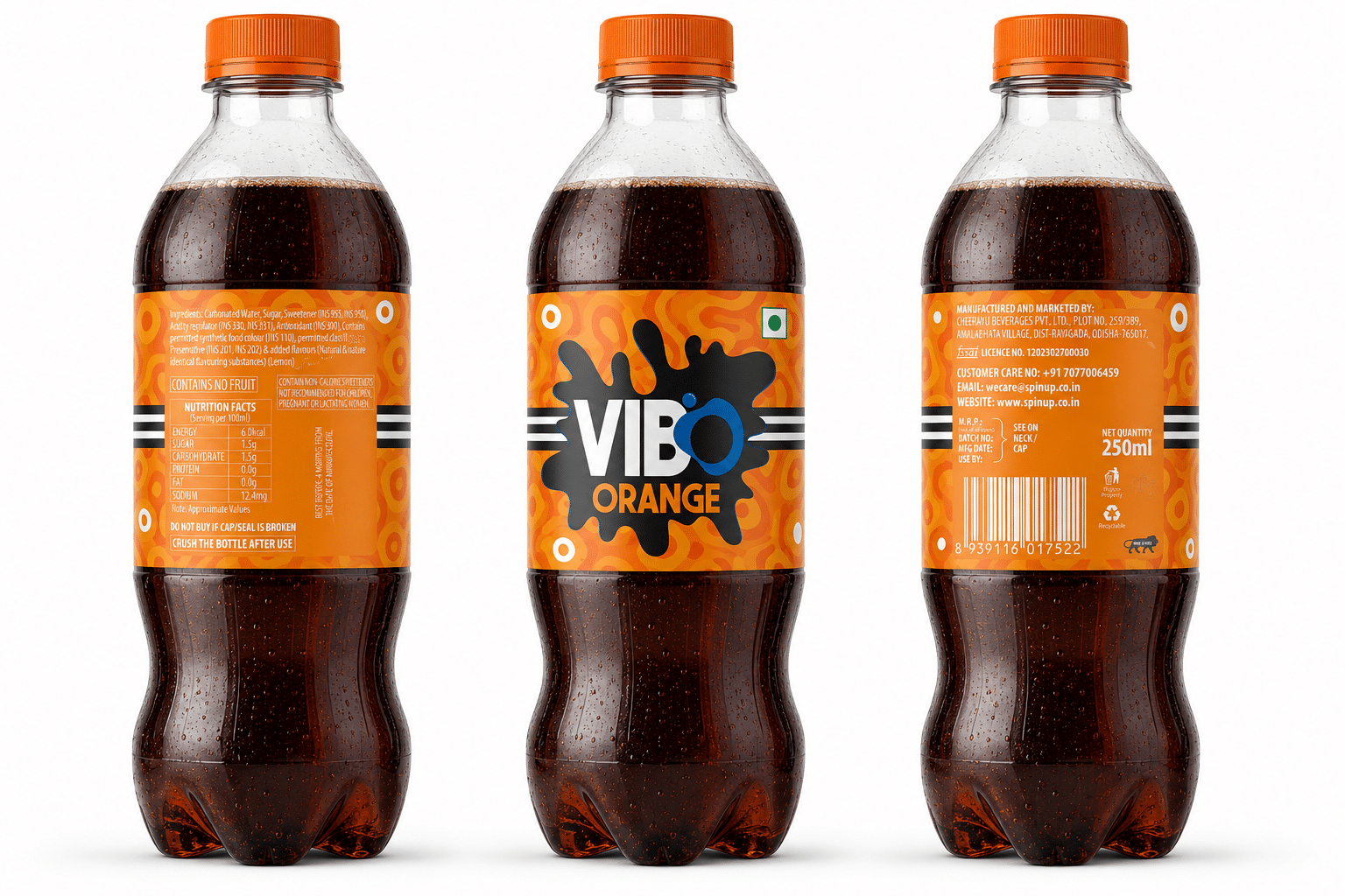
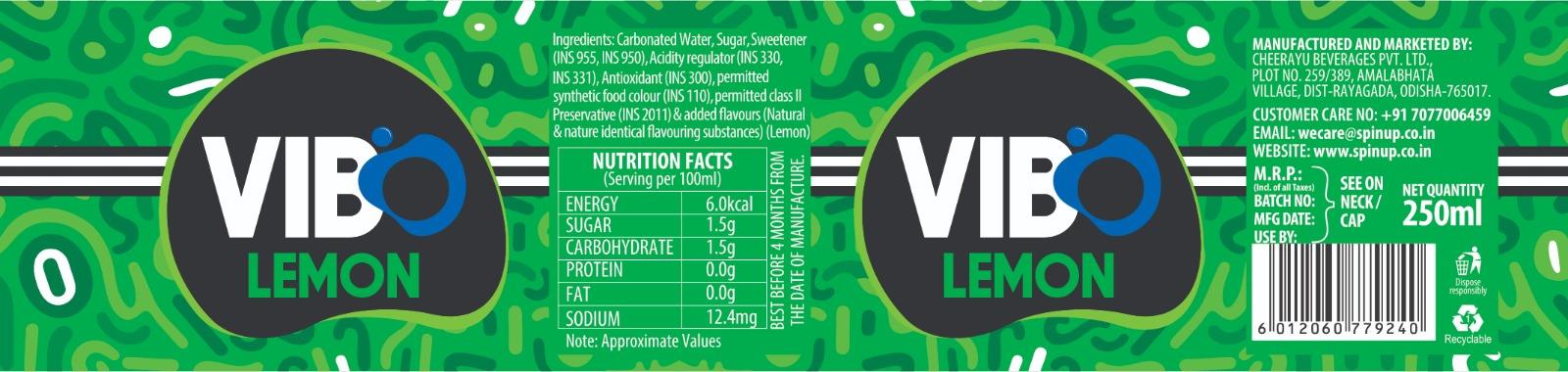
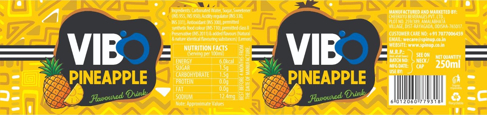
Rather than repeating the same design with a simple colour change, we explored individual background graphics and visual elements for each SKU. This allowed every product to have its own personality while remaining part of a recognisable VIBO family.
The balance between a consistent brand identity and flavour-specific design was central to the packaging approach. The logo, typography and overall design language brought the range together, while the individual graphics and colours helped differentiate each product.
The result is a packaging range that feels cohesive as a collection, yet gives each SKU its own visual presence.