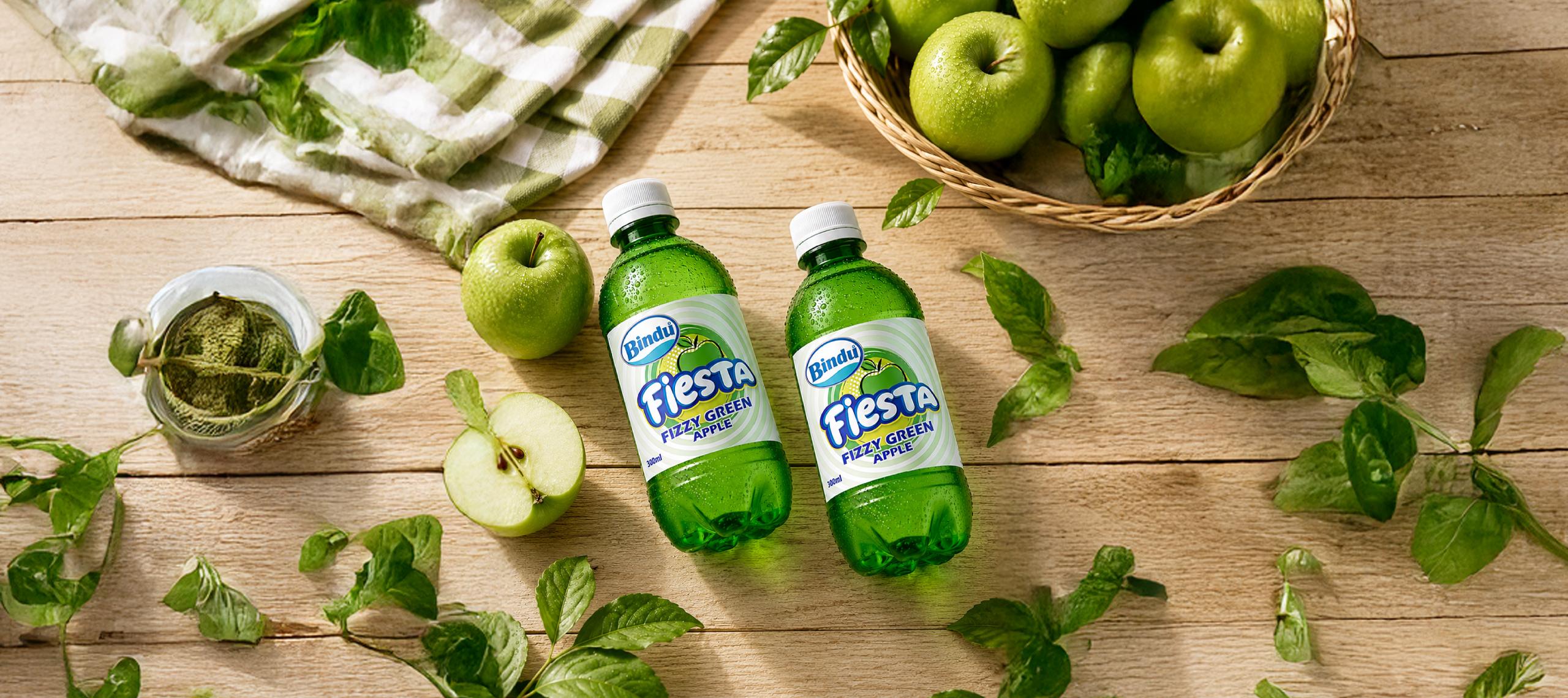
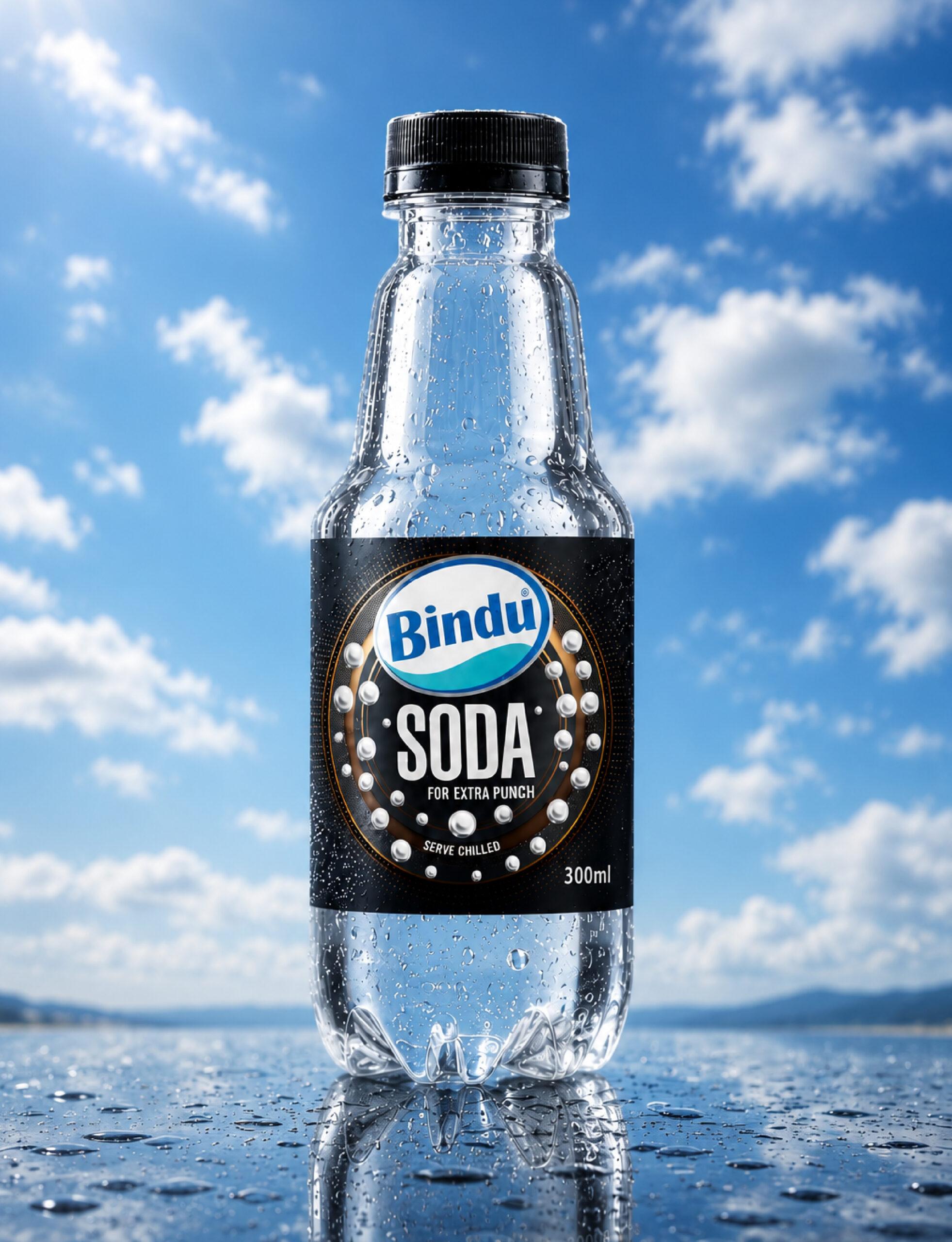
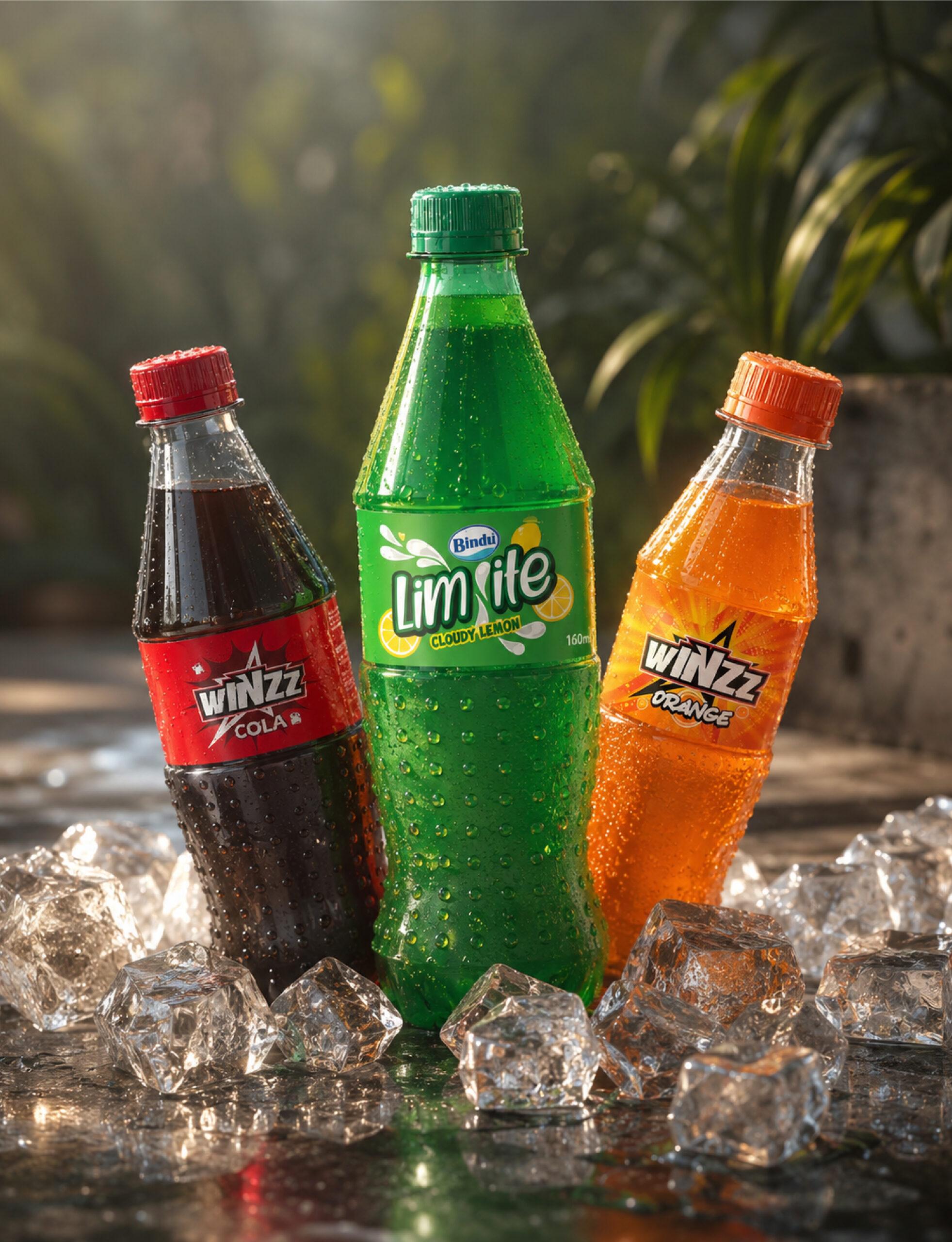
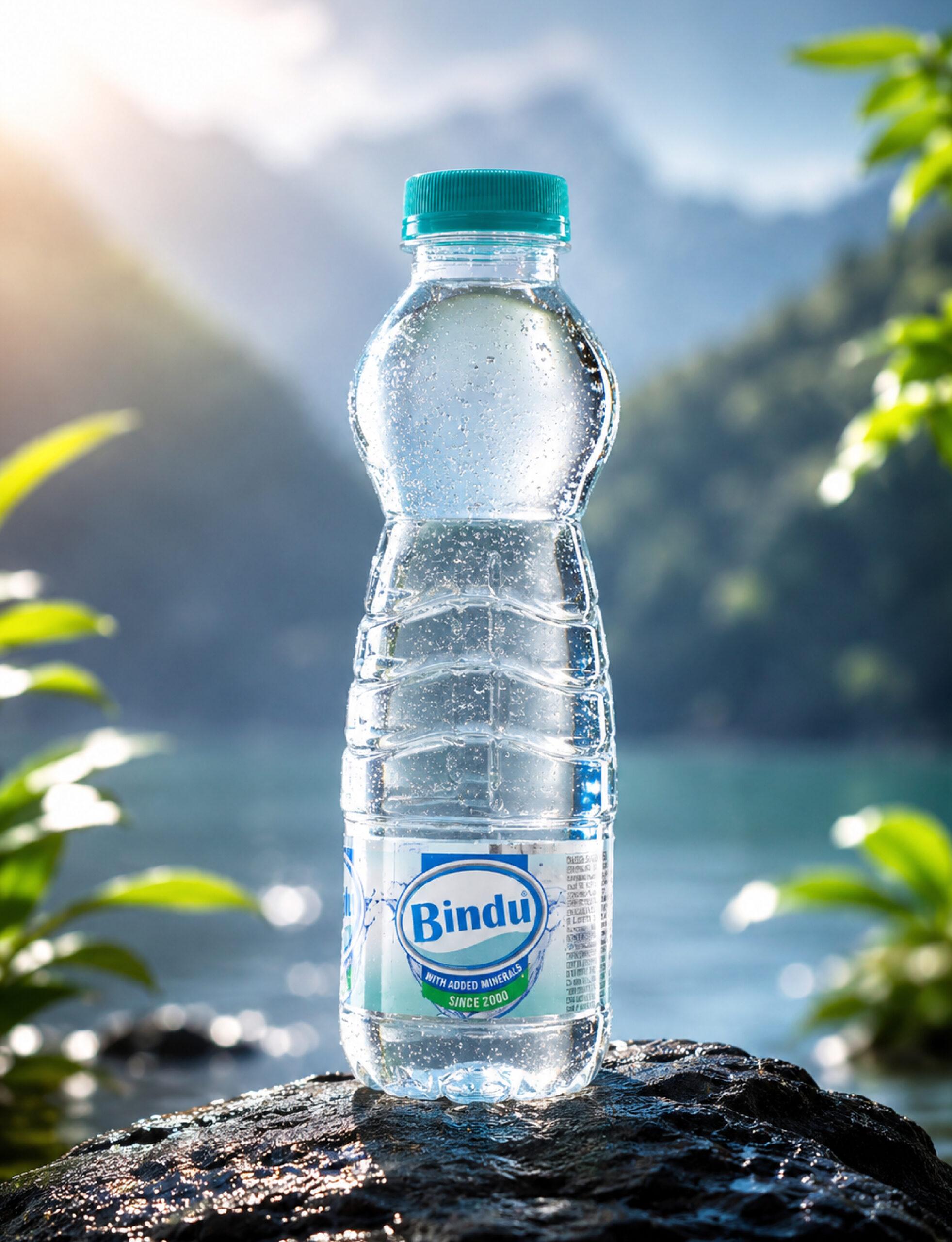
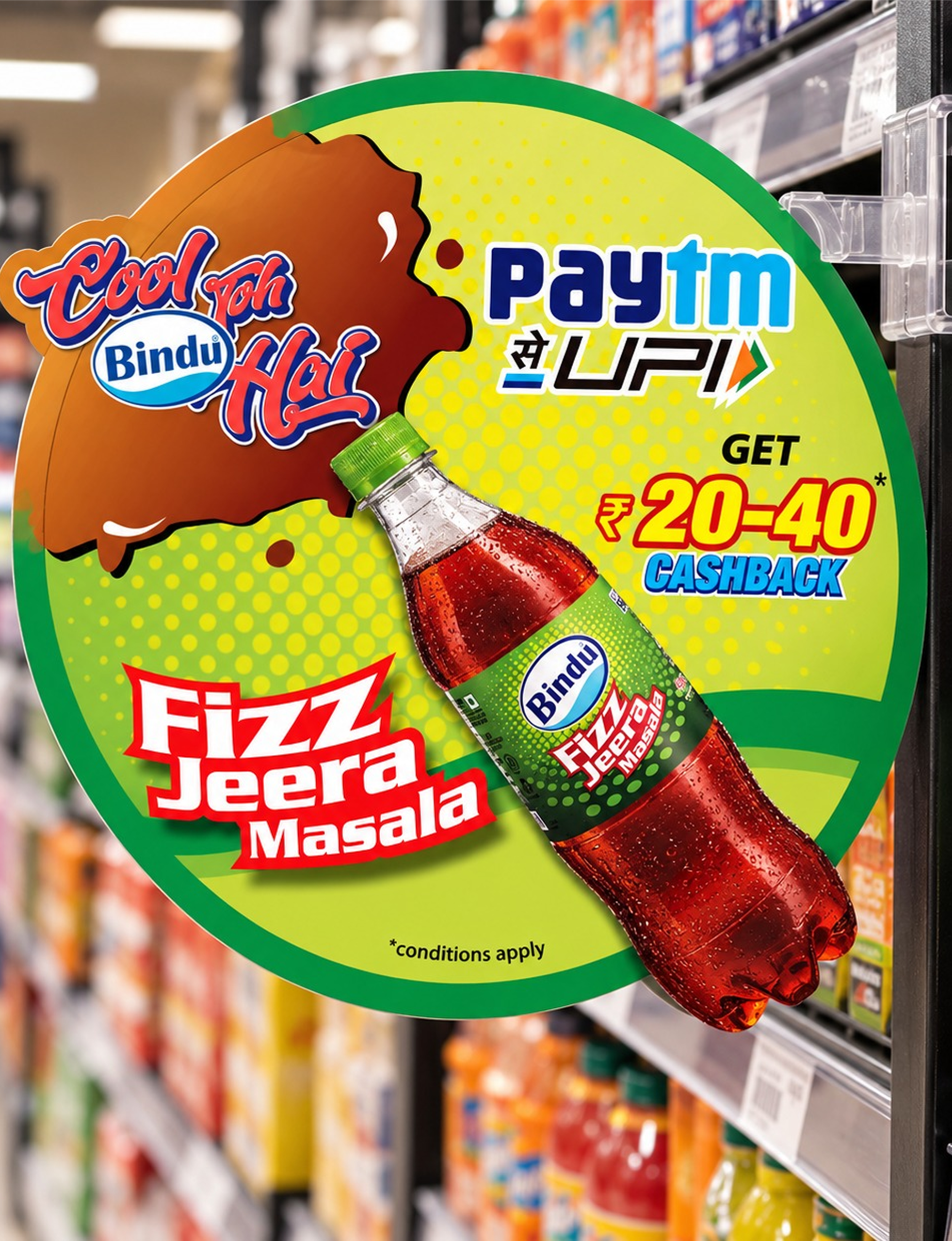
Over the years, we have partnered with Bindu across multiple categories, helping build and strengthen brands through a complete creative ecosystem.
Our involvement goes beyond packaging design—we support the brand at every consumer touchpoint, from brand naming and identity creation to packaging, product visualization, retail communication, and marketing collateral.
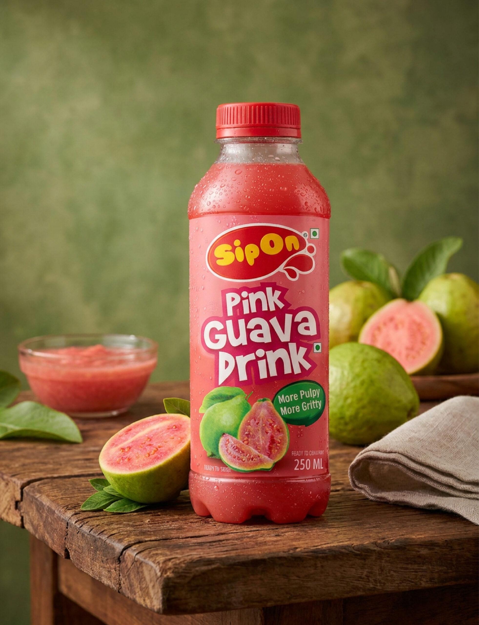
Sip On
Our thought was to bring together the strength of a gear and the fluidity of lubrication in one distinctive symbol. The golden flow at the centre represents the lubricant in motion, while the metallic outer form reflects precision, durability and engineering excellence. The interplay of gold and silver creates a premium, purposeful identity that captures the essence of Carol as a lubrication specialist.
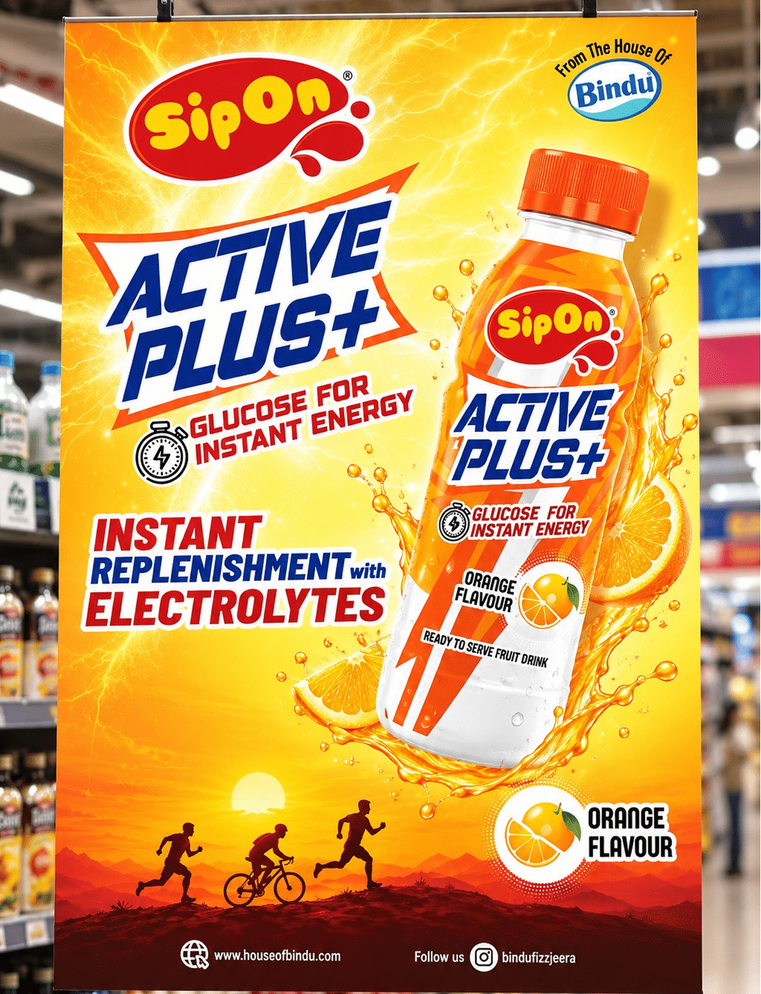
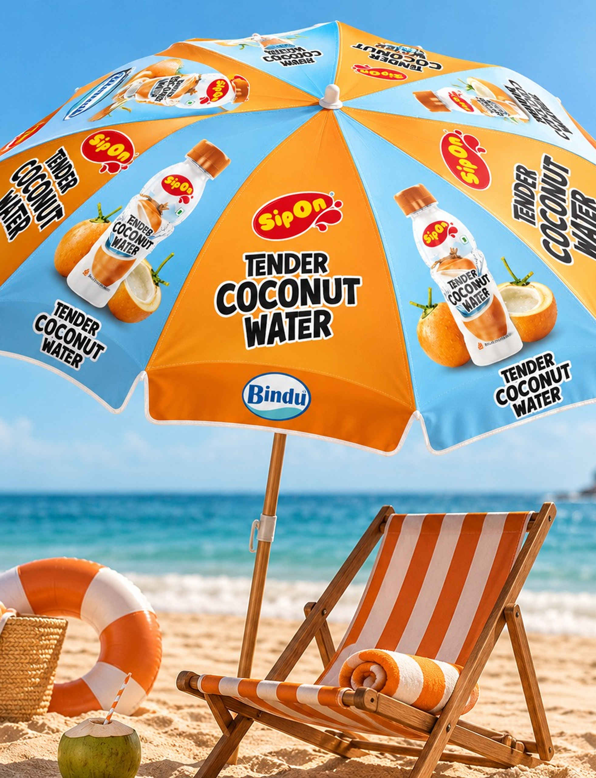
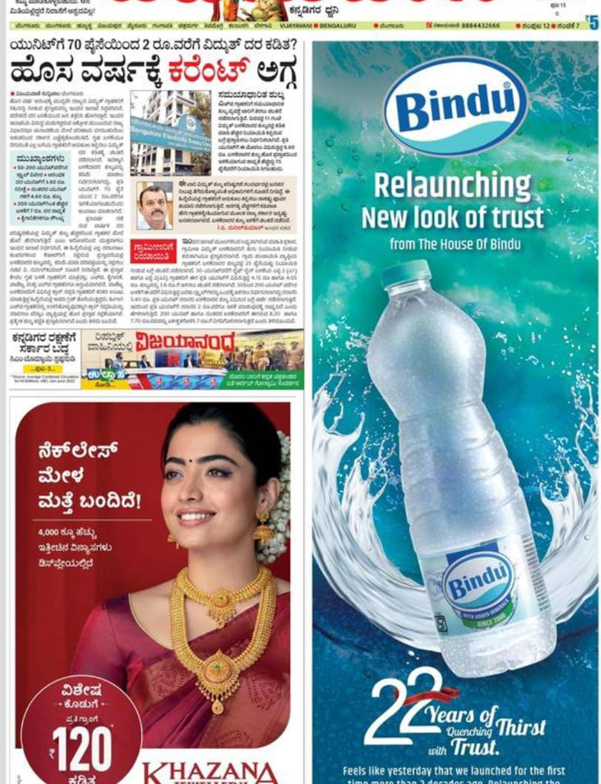
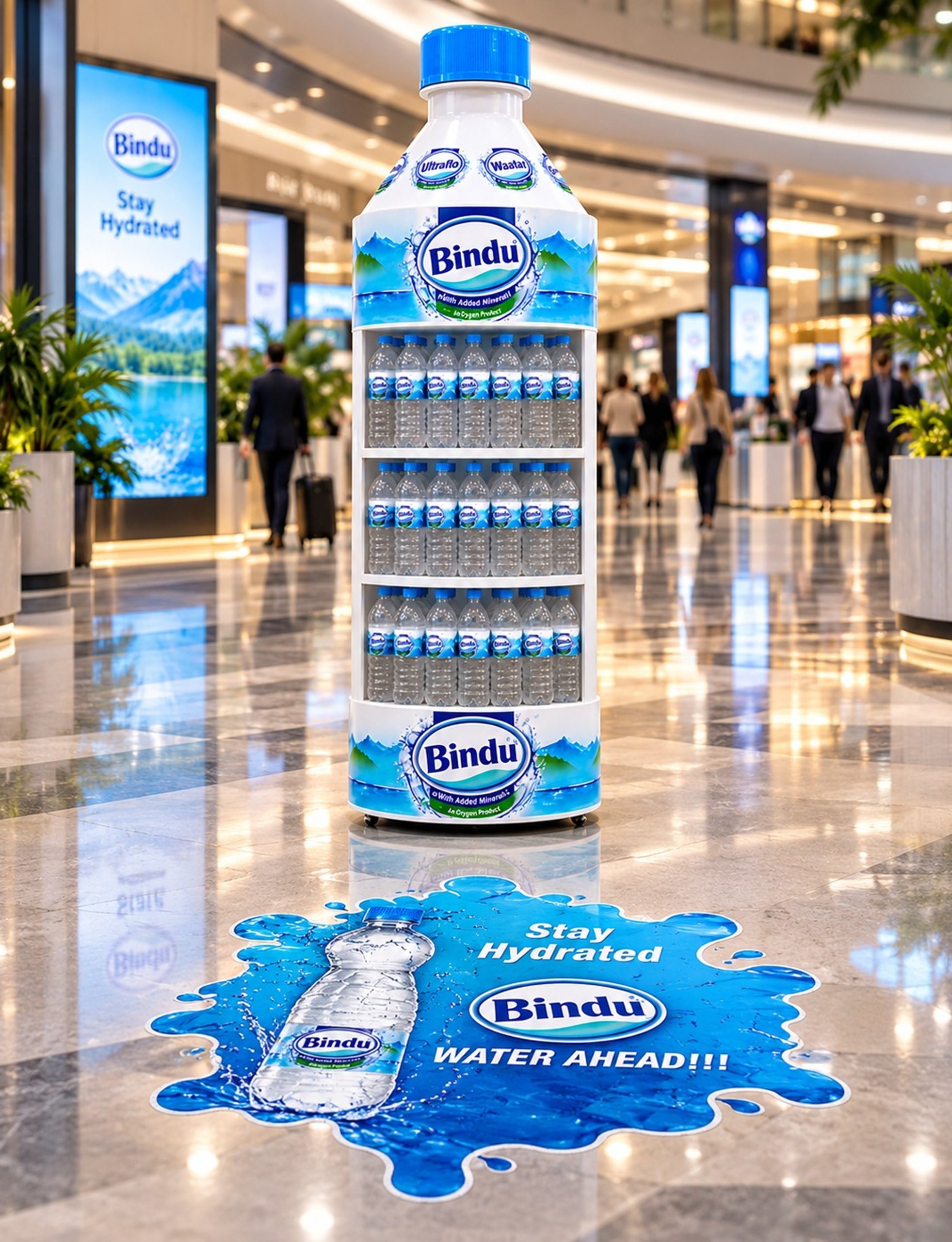
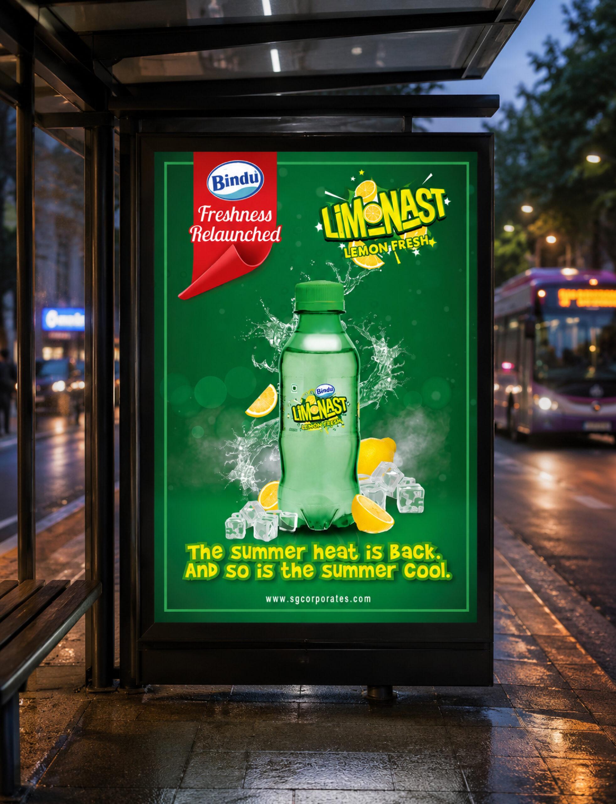
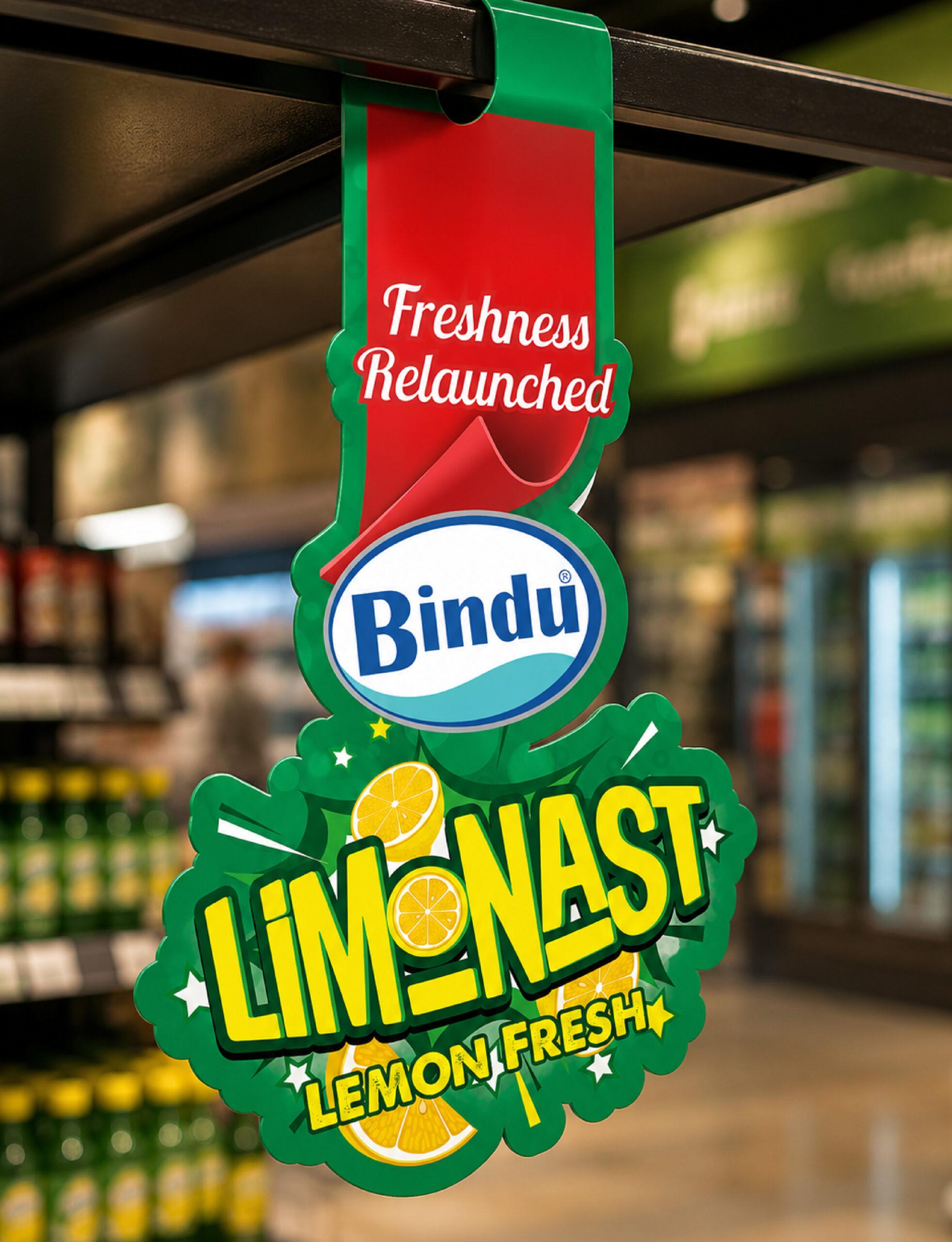
Our work with Bindu demonstrates how strategic design can influence every stage of a brand’s journey—from creating memorable brand names and distinctive packaging to developing impactful marketing communication, premium 3D renders, retail branding, hoardings, danglers, and promotional assets.
The result: Stronger shelf visibility, enhanced brand recall, and a cohesive consumer experience across every touchpoint.
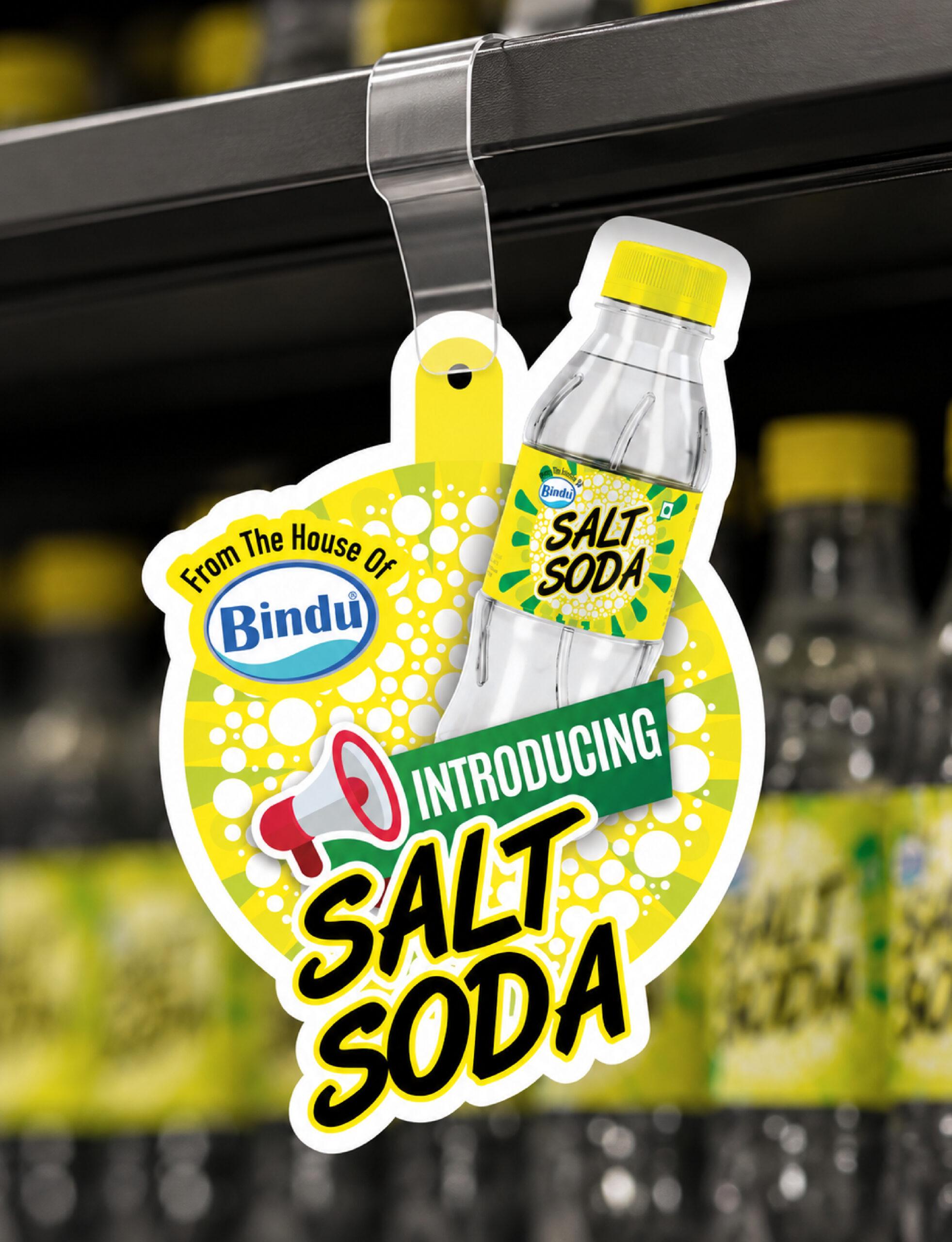
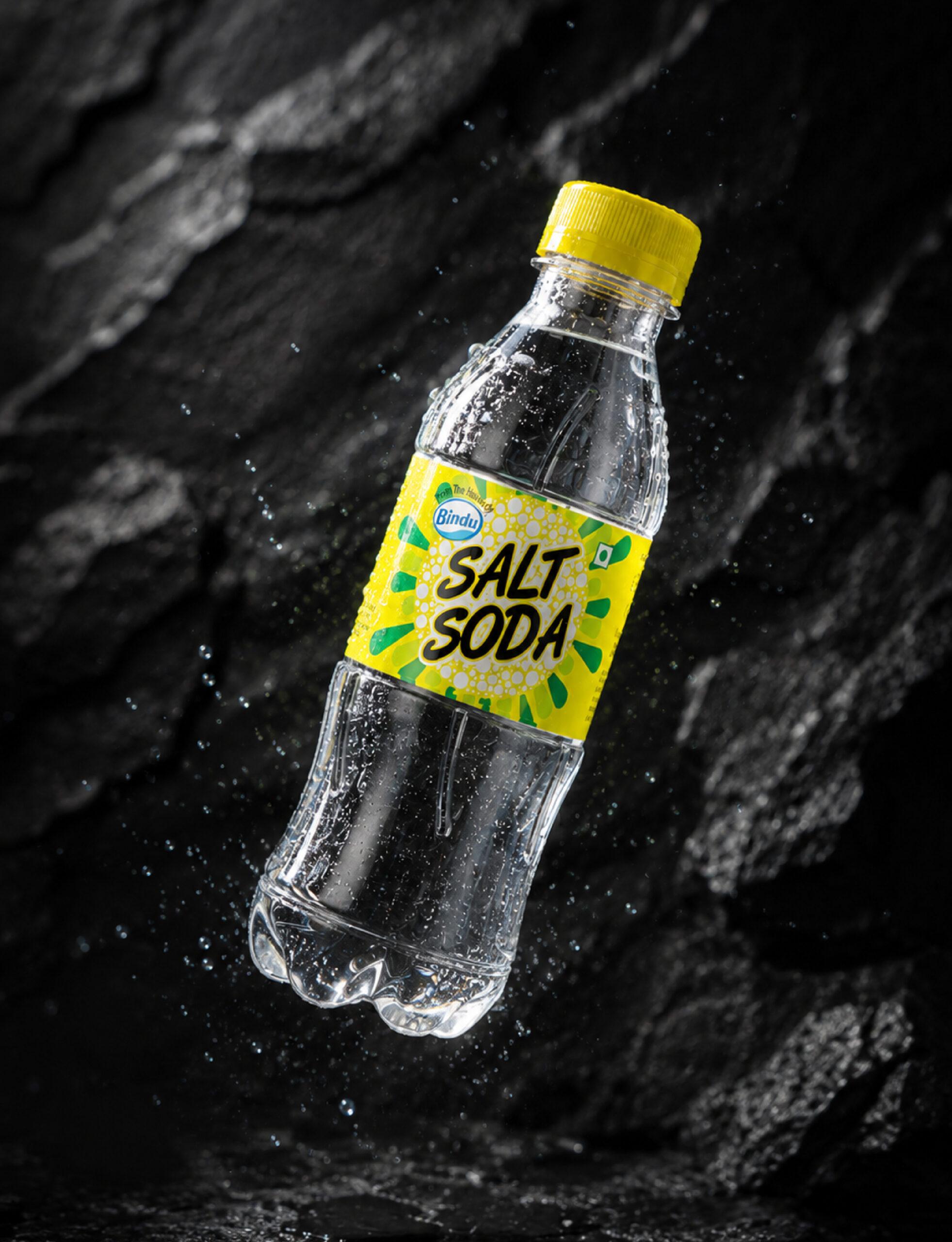
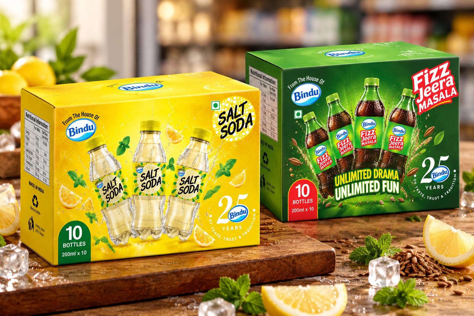
A refreshing take on a classic favourite! We partnered with Bindu to develop the packaging and brand communication for its Salt Soda range, creating a vibrant visual identity that captures the product’s refreshing character and strong shelf appeal.
Our creative scope encompassed end-to-end packaging design, including bottle labels, outer carton packaging, promotional danglers and 3D product mockups. The packaging uses a bright, energetic yellow palette, complemented by distinctive graphic elements to communicate the fizzy, refreshing appeal of Salt Soda.

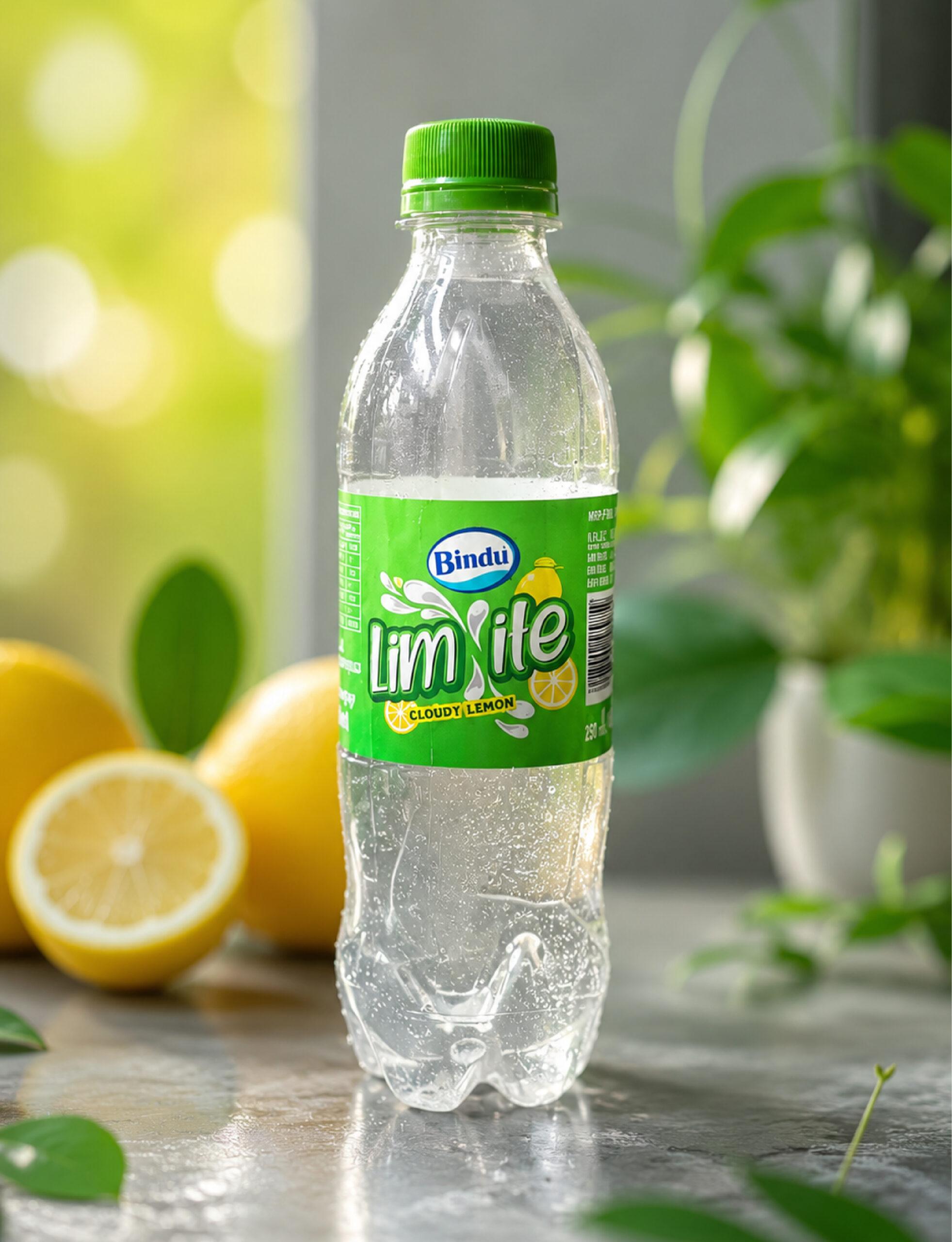
Limonast
Transformed a simple lemon drink into a distinctive, memorable brand with strong shelf presence and instant consumer recognition.
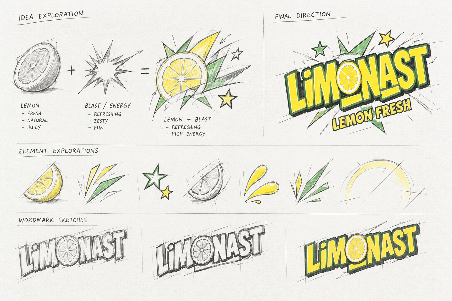
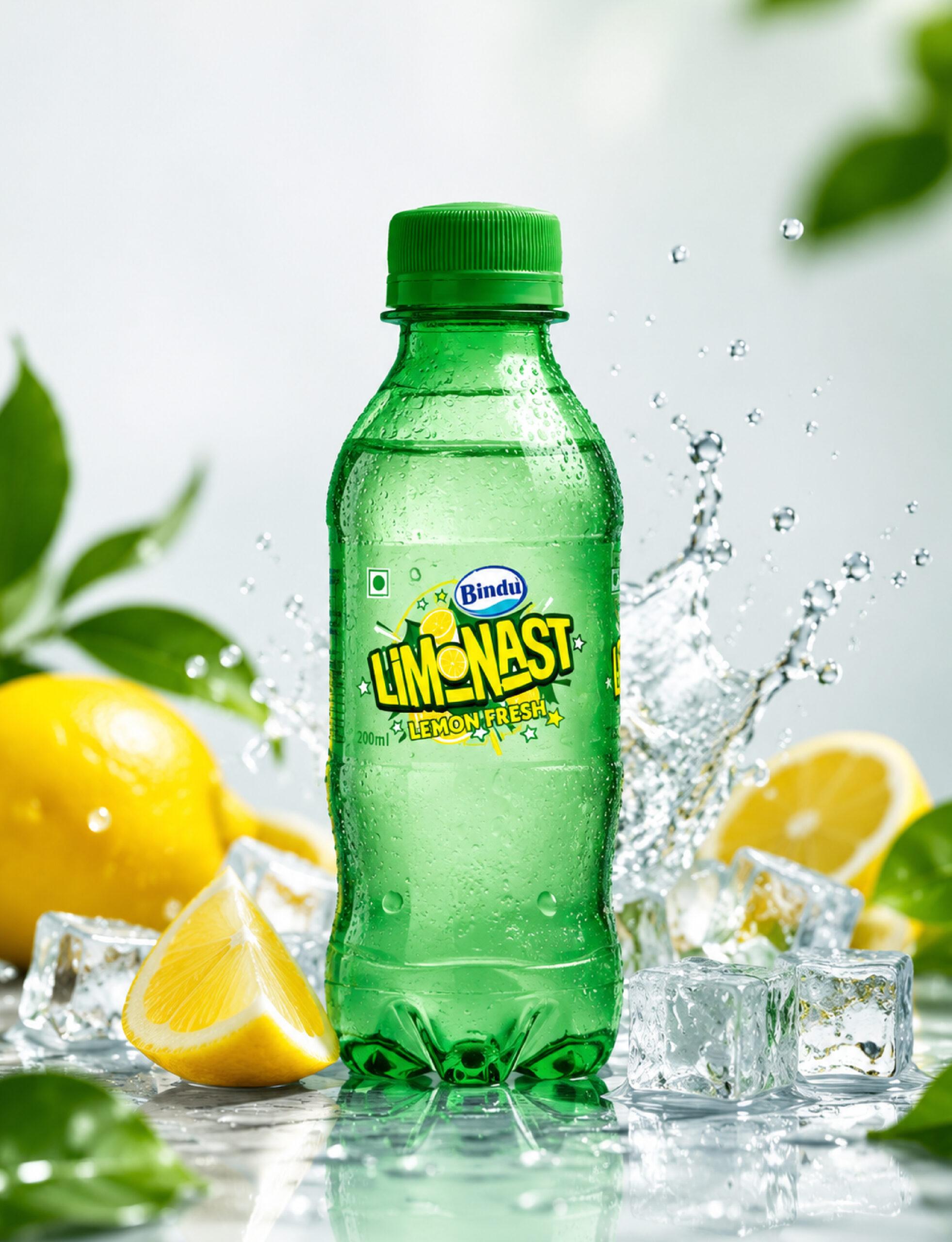
Limonast: The idea was to create a refreshing lemon CSD drink with a name that captures both the flavour and the fizz. Combining Lemon + Blast, we arrived at LIMONAST — a youthful, energetic name that communicates zest and refreshment. A transparent label on the green bottle creates the illusion of the branding being printed directly on the bottle, keeping the design minimal and uncluttered. This allows Bindu LIMONAST to take centre stage, with the green bottle reinforcing freshness and creating a distinctive shelf presence.
Created retail and promotional creatives that reinforced the product’s refreshing proposition through vibrant visuals and high-energy messaging.